Discover stage product image studio photography
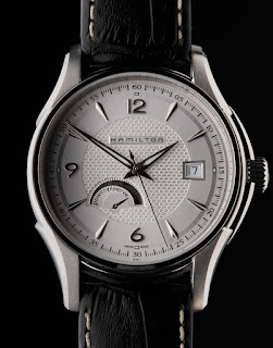
Image 1- Tim Hawley.
I really like this image because of it’s simplicity and sharp detailing of the watch. As there is a glass face on the watch, having watched the lecture I imagine the lights were placed either behind or to the side of the watch in order to not cause a reflection. As you can see on each side of the watch it is illuminated. The photographer also didn’t put the whole watch in the frame but focused on the face instead which is possibly an approach I will take if I am to shoot a watch because the main thing that draws people to a watch is the face.
Image 2- Timothy Hogan.
I really like this image as there are a number of fragrances all from the one brand. This is a concept I may look into using as I could do a brand advertisement rather than just a one fragrance advertisement. This image is not overly lit and it appears that the light is shining through the side of the bottles. I also believe there was some sort of filter paper used here to alter the colour as not all of these fragrances have a golden brown liquid in them. Overall I love the simplicity and the fact the image is just lit enough to see the bottles and the names of the fragrances.
Image 3- Oliver Oglesby.
This image incorporates some props which look to be some sort of tree branches surrounding the fragrance bottle, with the fragrance being the main focus point. I think the light may have some dark cards over each side allowing the light to just shine out of the middle giving a nice look on the Valentino logo. I really like the colour scheme of this image as the logs appear to be a similar tone to the bottle and the liquid. The overhead shot is another interesting aspect.


Comments
Post a Comment